Achieva

Achieva is a self-guided goal-tracking app designed for independent learners who want to build new skills or habits with more intention and motivation.
INTRODUCTION
Problem
Many self-driven learners struggle to stay consistent when building new habits or learning new skills. Without emotional support or visual feedback, it’s easy to lose motivation and abandon goals over time.
Target Users
Independent learners in their 30s and beyond—people who are actively pursuing personal growth through skill-building or habit-forming, but often without external structure or accountability.
Why This Group?
These users are driven but often overlooked in goal-setting apps, which tend to focus on productivity over emotional wellbeing. I chose this group because I could personally relate to the balance between ambition and burnout, and wanted to design for real, sustainable progress.
How It Helps
Achieva offers lightweight daily tasks and a simple mood tracker to help users stay aware of both their progress and their emotional state. It gives learners a sense of accomplishment and clarity, one day at a time.
Timeline & Role
The project took 9–10 week.
I was the sole UX/UI designer, responsible for the entire process—from research and strategy to wireframes, UI design, and prototyping.
RESEARCH
Summary
To gain insight into how users manage their goals and emotional state, I conducted one-on-one in person and remote interviews with four adult learners aged 34–38. Each participant was actively pursuing a personal or professional skill—ranging from language study to fitness and creative goals.
Research Method
I chose qualitative interviews over surveys to better capture the emotional context behind goal setting and follow-through. The sessions were conducted via video calls and lasted around 30 minutes each. I wanted to understand what challenges people face when trying to learn something on their own, and what helps them stay motivated or causes them to quit.
Key Interview Goals
-Motivation: What drives users to pursue self-directed learning?
-Obstacles: What emotional or logistical challenges do they face?
-Support Needs: What kind of encouragement or structure helps them stay consistent?
Sample Interview Questions
What were some challenges you experienced when learning a new skill? How were you able to overcome it or did it get in the way completely?
Have you ever stopped learning a skill? If yes, what was the main reason for quitting?
Synthesizing the Data (Key Insights)

Participants began with motivation but lost momentum after 1–2 weeks.
None of the participants actively tracked how they felt during their learning journey, even though emotional awareness plays a key role in long-term consistency.
Different user types needed personalized goal-setting strategies, shaped by their motivation, learning preferences, and lifestyle.
Design Implication
This research directly shaped two core features of Achieva:
1. Daily Mood Tracker – A visual feature that allows users to log their emotional state each day and observe patterns over time
2. Lightweight Daily Tasks – To lower friction and support long-term habit formation
DEFINE
Design process
I started with early concepts, tested ideas informally, and refined key features based on user insights—especially around emotional triggers and task fatigue.

Persona
Eric(Blue)
Wants structured, low-effort learning after work to feel steady progress without mental fatigue.
Joelle(Red)
Seeks consistent, time-efficient support to maintain motivation for her personal goals despite weekend constraints.
User Flow & Sitemap
This combined user flow and sitemap outlines Achieva’s core user journey—from onboarding to long-term engagement.
It’s designed to minimize cognitive load and support emotional consistency—helping users stay engaged as they build new habits.
The onboarding flow helps users move smoothly from app launch to a personalized home screen, using simple steps that reduce friction and cognitive effort.
User Flow

From the Home screen, users can log their mood, track progress, and manage goals.
Personalization and reminders are accessible via Settings, keeping control in the user’s hands.
This design empowers users to start, stay consistent, and grow—making learning feel achievable and emotionally accessible.
Sitemap

Decision Highlights
Replaced long-term goal breakdowns with simple daily actions
→ Based on feedback that users felt overwhelmed by rigid goal structures.
Designed flows with minimal cognitive load
→ To encourage daily engagement even when users feel mentally fatigued.
Introduced non-judgmental mood tracking to support emotional consistency
→ Based on research insights showing that users often felt discouraged when they couldn’t “perform” emotionally, the feature encourages reflection without pressure or comparison.
DESIGN
Sketches & Wireframes

This evolved into wireframes focused on:
• One-screen daily tasks and mood tracking
• Clear hierarchy with minimal interface noise
• Predictable patterns to reduce onboarding effort
This phase helped validate layout logic before investing in UI polish.
Visual Direction & Branding
Visual System Overview
A cohesive set of design elements that reflect Achieva’s calm, supportive tone—designed for clarity, accessibility, and emotional ease.
Digital Wireframes


Color Palette
Soft neutrals are paired with cool green and blue tones to create a calm, emotionally relaxed experience.
These colors were selected to support calm, consistent engagement without urgency or pressure.
Typography
Noto Sans KR was used across platforms for its clean readability and multilingual support.
Its neutral tone fits the structured, emotionally balanced voice of the app.
Mood Icons & Visual Cues
Rounded shapes and neutral expressions avoid judgment, making mood tracking feel safe and approachable.
The goal was to support consistency, even on emotionally difficult days.
Design Decisions & Reflection
Prioritized emotional accessibility over pure productivity.
→Users needed to feel safe checking in, even on off days.
Used micro-interactions and affirming copy.
→Simple animations and phrases like “You showed up today” helped reinforce consistency.
Mobile-first layout with thumb-friendly tap zones.
→Designed for quick, effortless use by busy learners.
Favorite Part of the Process
I especially enjoyed shaping the tone and behavior of the mood tracker.
It was a moment of realization—design isn’t just about function, but also about offering emotional support.
This was when I truly saw UX as a tool for empathy, not just efficiency.
I began with hand-drawn sketches to explore lightweight, mobile-first layouts. The goal was to minimize cognitive load and reduce decision fatigue. This was especially important for users managing busy routines and emotional highs and lows during self-guided learning.
Sketches
TEST
Test Overview
A usability test was conducted with five participants to evaluate how intuitive the core flows were for first-time users.
Each session lasted around 30 minutes, combining both remote and in-person formats.
Key Test Goals
-Ease of use: Can users complete tasks with minimal guidance?
-Clarity: Are flows and screens intuitive without onboarding?
-Emotional response: Does the tone feel non-judgmental and supportive?
Success Metrics
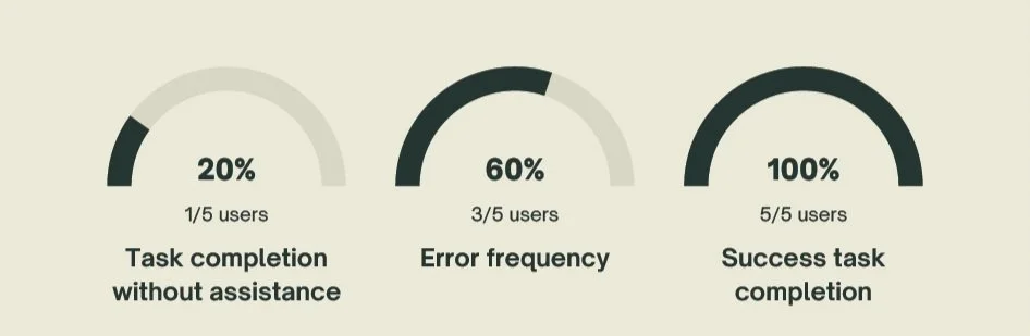
These metrics validated the overall design direction, while pointing to areas for improvement in clarity and guidance.
Iterations Based on Feedback

• Improved the ‘Day of Learning’ icons by adding color and clearer facial expressions to enhance visual feedback and intuitiveness.
• Refined the quiz question copy to replace vague phrases like “early in the morning” with specific time ranges for better user comprehension.
• Clarified mood tracking UI elements to ensure users could quickly interpret emotional input without hesitation.
Prototype (Used During Test)
A high-fidelity prototype was created in Figma to demonstrate key interactions and test core flows. During usability testing, users were guided through:
• Mood check-in and daily task tracking
• Goal-setting quiz during onboarding
• Habit feedback and progress summary
This prototype enabled realistic interaction without needing full development, and helped surface usability issues early in the process.
Conclusion
What I Learned
Designing Achieva helped me realize that UX is not just about solving functional problems, but also emotional ones. I learned how important it is to consider users’ emotional states when creating features for consistency and motivation.
Next Steps
I plan to develop higher-fidelity UI elements, conduct another round of usability testing, and continue expanding Achieva’s features.
Challenges Faced
Balancing clarity with emotional nuance was a constant challenge—especially when designing the mood tracker and onboarding quiz. It required multiple iterations to make the flows feel intuitive without being overwhelming.
What I’d Do Differently
If given more time, I would integrate onboarding tutorials and test different interaction patterns to further reduce hesitation for first-time users. I also see an opportunity to refine micro-interactions for added encouragement.